
Table of Contents
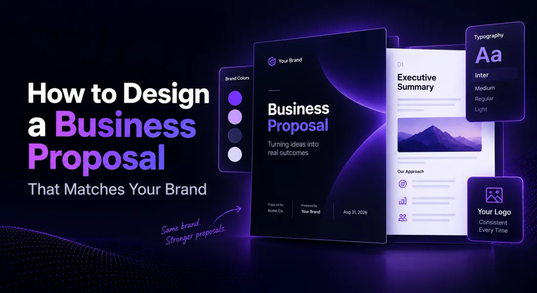
How to Design a Business Proposal That Matches Your Brand
A client rarely says out loud that a proposal looked off brand, they just quietly notice, and that quiet noticing does more damage than any single line of copy can undo.
Most businesses do not lack a brand, they lack a system for applying it consistently once someone is under deadline pressure and reaching for whatever formatting gets the document out the door fastest.
The result is a proposal that technically has your logo on it, but reads like it was assembled from three different documents, because in a sense it was.
Proposal design is not about decoration, it is about making a client recognise your business the second the document opens, and read it without the layout getting in the way.
This guide covers the steps for getting there, what actually breaks brand consistency in practice, and when the effort is worth doing yourself versus handing it to a designer.
What Does Brand Consistent Proposal Design Actually Mean?
A brand consistent proposal uses the same logo, colours, fonts, and tone a client would already recognise from your website or a past email, applied the same way every time rather than reinvented per document. The content still has to do the actual persuading.
What inconsistent design does is undercut that content before a client has read a single sentence. By making the proposal look like a template with your name pasted in rather than something your business actually made.
For a deeper look at what separates a proposal that lands from one that does not, the anatomy of a winning proposal covers the structural side alongside design.
Where Proposal Design Usually Breaks Down
Most brand inconsistency is not a big, obvious mistake, it is a handful of small drifts that compound across a long document.
- The cover page is fully branded and later sections quietly drift, a slightly different blue, a fallback font because the real one was not installed
- Pricing tables are rebuilt by hand each time, so no two proposals look quite the same
- Whoever writes the proposal picks their own tone, so a formal cover letter is followed by a casual scope section
- The logo is a low resolution screenshot pulled from a webpage rather than the original file
- Spacing and heading styles shift partway through, usually because the document was assembled by copying from an older one
None of these individually ruin a proposal. Together, across a fifteen page document, they add up to something that reads as unfinished, even if the client could not tell you exactly why.
The Steps to Designing a Business Proposal That Matches Your Brand
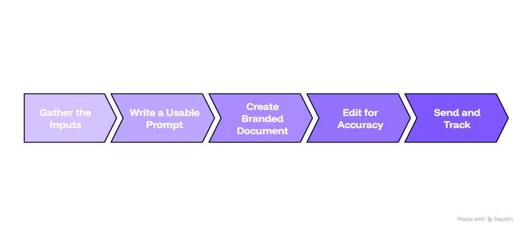
Five steps cover most of the ground. Gather your brand elements properly, choose a layout that fits the content, and start from a proposal canvas instead of a blank page. Apply your brand consistently rather than just on the cover, and review for consistency before you send.
Step 1: Pull Your Brand Elements Together Before You Start
Before opening a document, have your logo file, exact brand colour codes, approved fonts, and a clear sense of your tone of voice on hand.
Skipping this step is the single biggest reason proposal design drifts, because it forces someone to guess a colour or substitute a font halfway through writing, under time pressure, rather than before.
Have these ready before you start:
- A high resolution logo file, not a screenshot pulled from your website
- Exact brand colour codes, not an approximation picked by eye
- Approved fonts, or the closest available match if your brand font is not web safe
- A short, written reference for tone: formal, conversational, or somewhere between, so it does not depend on who is writing
Step 2: Choose a Proposal Layout That Fits the Content
Proposal layout should follow what each section needs to communicate, not the other way around. A pricing heavy proposal, like a combined quotation and proposal, needs a layout built around clear tables. A narrative, consulting style proposal needs more room for prose to actually breathe.
A useful way to think about layout for proposal content is by what each section is doing for the reader. Sections that inform can run text heavy, while sections that need a fast decision, like pricing or next steps, work better in a tighter, table driven layout.
Visual choices matter as much as structure here. The importance of visual proposals covers why visual elements affect how a proposal actually gets read, not just how it looks.
| Section type | Layout that fits |
|---|---|
| Executive summary | Short paragraphs with a clear visual hierarchy, this is often the only section a busy stakeholder reads in full. |
| Scope and deliverables | A structured list or table rather than a dense paragraph, so it can be scanned quickly. |
| Pricing | A formatted pricing table with clear totals, not pricing buried inside a sentence. |
| Timeline | A simple table or visual timeline rather than a paragraph description of dates. |
| Next steps and signature | A short, clearly separated closing section so it does not get missed at the end of a long document. |
If you are deciding between a longer document and a tighter one, one page proposals covers when a single page layout works and when it genuinely does not.
Step 3: Start From a Proposal Canvas Instead of a Blank Page
A proposal canvas is a pre-structured starting point, sections already blocked out for an executive summary, scope, pricing, and next steps, that you fill in and restyle rather than build from nothing each time.
Starting from a canvas is what actually keeps structure consistent across every proposal your business sends, especially once more than one person is writing them.
A drag and drop document editor with pre-built section blocks does this well, since the canvas already carries your brand settings rather than needing them reapplied by hand on every new document.
Step 4: Apply Your Brand Consistently Across Every Section, Not Just the Cover
This is where most proposal design actually falls apart in practice. It is easy to get a cover page right and then let everything after it drift, since nobody is checking section five against section one while writing under a deadline.
- Use the same colour values in every section, not a close approximation picked by eye
- Keep heading styles and spacing identical from the first page to the last
- Reuse the same pricing table format throughout, rather than rebuilding it per section
- Keep the same tone of voice from the executive summary through to the closing section
Storing your brand settings once in a reusable content library removes most of the manual reapplication. Colours, fonts, and reusable sections are already set rather than rebuilt by memory each time a new proposal starts.
Step 5: Review for Visual Consistency Before Sending
Before a proposal goes out, do one pass focused purely on design rather than content, checking that colours, fonts, spacing, and tone hold steady from the first page to the last.
This is a different pass to proofreading, and skipping it is how a strong document still ends up looking unfinished.
| Common mistake | Fix |
|---|---|
| Cover page is fully branded, later sections drift | Apply the same colour and font settings to every section, not just the first page. |
| Pricing table uses a different style than the rest of the document | Reuse one pricing table format throughout the proposal. |
| Tone shifts from formal to casual partway through | Read the whole document in one pass, checking tone alongside content. |
| Logo is a low resolution screenshot | Use the original logo file rather than a copy pulled from a webpage. |
Should You Design It Yourself or Bring in a Designer?
Most businesses can handle this without hiring anyone, provided the brand elements are actually pulled together once and reused. A designer earns their cost in narrower situations.
- DIY is enough if your brand assets already exist in brand identity guidelines and just need to be set up once inside a canvas or template
- DIY is enough if your proposals follow a fairly standard structure, scope, pricing, timeline, next steps
- A designer is worth it if you are building a genuinely custom, high stakes proposal for a major client and want something that will not be reused elsewhere
- A designer is worth it if your brand assets themselves are inconsistent or missing, since no proposal tool can apply a brand that has not been properly defined yet
Final Word
Design supports the content, it does not replace it. How to write a business proposal covers the content side this guide does not. Business proposal design does not need to be reinvented for every document, it needs to be set up correctly once and reapplied consistently after that.
A proposal canvas with your brand settings already built in removes most of the manual work, and lets the actual effort go into the content rather than the layout. To see this in practice, create and send proposals starting from a branded canvas rather than a blank document.
Frequently Asked Questions
What is the best layout for a proposal?
There is no single best layout, the right one depends on what each section is doing. Text heavy sections like an executive summary need room to breathe, while pricing and timelines are clearer in a table than a paragraph.
What is a proposal canvas?
A proposal canvas is a pre-structured starting point with sections already blocked out for an executive summary, scope, pricing, and next steps. So you fill in and restyle content rather than building the structure from a blank page each time.
How do I keep business proposal design consistent across a team?
Store your brand colours, fonts, and reusable sections in one shared location rather than leaving each person to recreate them by eye. A shared content library or canvas is the most reliable way to keep design consistent once more than one person is writing proposals.
Does proposal design actually affect whether a proposal wins?
Design will not save weak content, but inconsistent or unbranded design undermines a strong proposal by making it look unfinished before a client has read the substance. Clean, brand consistent design removes a reason for a client to hesitate, without needing to do any persuading on its own.
How much time should proposal design take?
Very little, once your brand settings are set up once and stored somewhere reusable. Most of the time proposal design costs a business goes into rebuilding the same formatting by hand for every new document, which a saved canvas removes almost entirely.

Ronak Surti

 Ronak Surti